Ranking Every (Current) Pro Lacrosse Uniform
Yo, you're gonna hate this, but...
Friends, with last week’s unveiling of all the PLL jerseys and June’s unveiling of all the MLL jerseys for the upcoming truncated seasons/tournaments, I had no choice but to construct a completely objective (subjective?) ranking of both league’s jerseys. Okay, I didn’t HAVE to do it, but you’re already here and it’s too late now. Look, I’m not saying you’re gutless for just ranking one league, but I’m not not saying that, either. If you haven’t already skimmed the list to find out where your favorite team falls, then let me formally invite you to read through this list in its entirety.
13. Waterdogs
Tagline: Every jersey graphic is a revenge jersey graphic
Best feature: The color scheme is pretty great. Unfortunately, that potential is completely and totally thrown away in favor of water ripples and a gradient fade. Funny how everyone who hated on gradient fades in jerseys all of a sudden seemed to love this design. You know who you are. The reason this jersey is ranked last is actually because of the potential that was wasted here. It’s not that the jerseys are “bad”, they’re just...wasteful. All flash; zero substance. Nothing sadder than wasted potential.
Team it also looks like: A random DII team that couldn’t get Nike or Under Armour to make their jerseys so they let the SID’s cousin design the jerseys, but it turns out that the cousin is 12. There were so many ways for the jersey to go and the one they chose is so obviously the most juvenile. Sorry, not sorry.
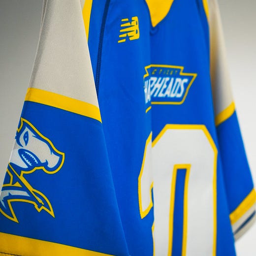
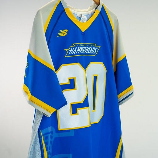
12. Connecticut Hammerheads
Tagline: Hammerhead Sharks are endangered animals that definitely aren’t indigenous to Connecticut
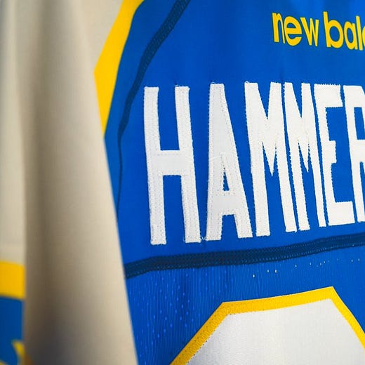
Best feature: At least you can read the numbers? Yellow and Blue might be the colors of the Golden State Warriors, but this flat out doesn’t work because it’s a copy of a copy of the Florida Launch. At least the Launch name made sense. They have all sorts of rockets in Florida. The mascot for the Hammerheads looks like a rejected proposal to make a new sugary breakfast cereal with all the different types of sharks. They picked the Hammerhead to be on the box because it’s so distinct! It is distinct in its atrociousness.
Team it also looks like: The basketball team from the Matt Nover vehicle “Blue Chips” (this joke is a DEEP cut for my 90’s people) as well as the aforementioned Bay Area Steph Currys. It’s just...wildly uninspiring. Even the helmets are kind of on the nose. They’re grey because sharks are grey. Lazy. Lame. Lamentable.
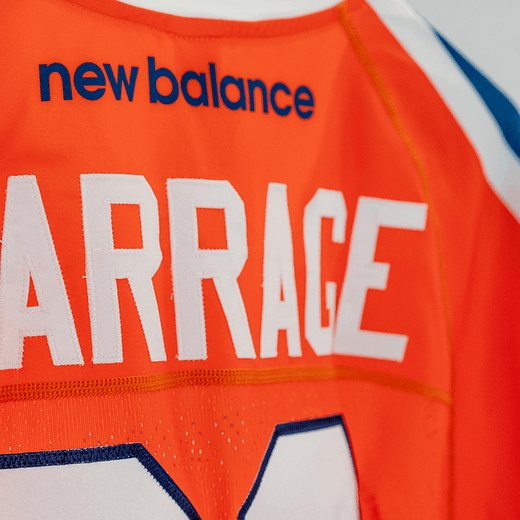
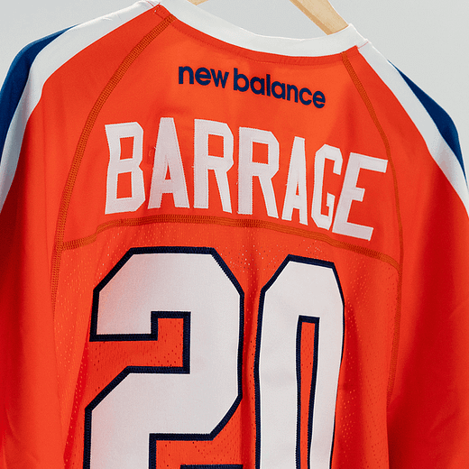
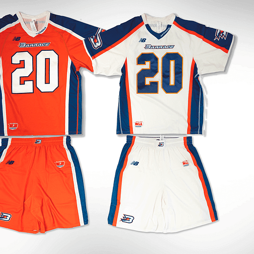
11. Philadelphia Barrage
Tagline: We won so many MLL championships with defense! Remember us? (We are totally not the dumpster fire of a franchise that was once known as the Atlanta Blaze).
Best Feature: Their new all navy helmets are flames, but we aren’t ranking helmets here. The Orange top is the wrong use of orange and blue in every conceivable way design-wise. It’s pretty obvious that the entire outfit is meant to evoke emotional attachment to the great Barrage teams of yore, but I got bad news - most of those fans aren’t watching anymore. Nostalgia is a hell of a drug, but the delivery method of these particular stimulants is more of a suppository than a vapor.
Team it also looks like: Very strong Edmonton Oilers vibes. I know there is a lot more navy there, but I can just feel the dynastic connections between the franchises: both once the greatest in their sports, now just full of youth and promise that amounts to...trading away the best players. It’s not too soon for that comparison and I am not sorry.
10. Atlas
Tagline: We get the best TV slots. Hey, man, if you can get on the Atlas you know you can put an extra exposure clause in your sponsorship contract that ensures you get a bonus payout.
Best feature: The topographical map texture is very cool. It is without a doubt the best thing about the entire design. I don’t know if the rest of the kit lives up to it. I know the mascot can't be a map that you find in the back seat pocket of your family SUV, but why is it a bull? Was it supposed to be a bull skull to represent being lost without an Atlas to guide you? Fraudulent! That bull is clearly alive. I digress. Is that...purple as the accent color? It’s going to be so weird seeing Pannell in another primary shade.
Team it also looks like: Johns Hopkins. Hunh. Weird. Wonder why that is? I guess we will never know…
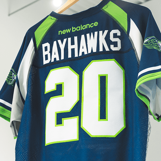
9. Chesapeake Bayhawks
Tagline: Lyle Thompson plays for us! We are WINNERS!
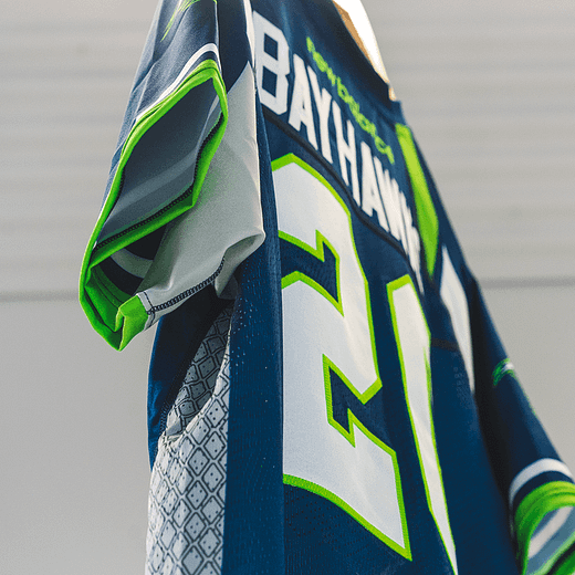
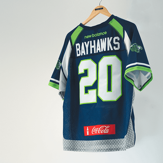
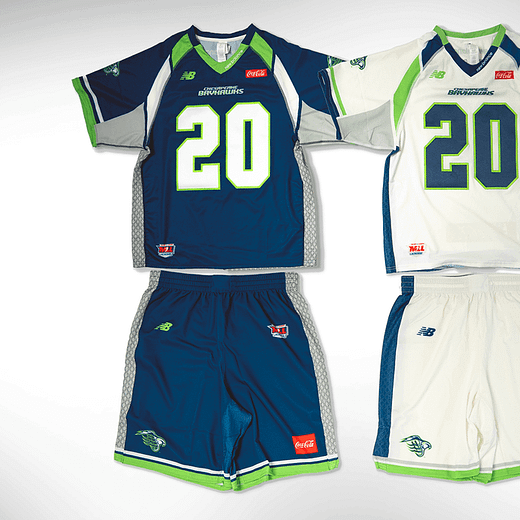
Best feature: The neon green accent color is the best part of the Bayhawks’ entire oeuvre. Everything else about this design commits the cardinal sin of being boring. Boring is, in many, ways worse than bad. Why would a hawk even be in the bay? It should be a Seagull and we all know it. Those are the only birds I’ve seen in Maryland anyway; mean and accosting flying demon creatures. At least Salisbury put a sweater on theirs to class it up; they didn’t make up an imaginary animal. Unless a Bayhawk is just a regular hawk that loves to hang near the bay? That’s one chill hawk.
Team it also looks like: The Dallas Mavericks and every other team that has a Navy-based color scheme and a bird for a mascot. Did you know that bird mascots are the most common sports mascots across all levels? To be fair there are a lot of birds, but there is only one bay-hawk that ruins every spellcheck. That’s the only unique thing about this team’s visual appeal. This uniform is wildly unoriginal and it’s the only kit that continually dropped every time I re-examined the rankings.
8. New York Lizards
Tagline: Everyone on this team is an attackman. The roster doesn’t necessarily lead to teams losing places on this list, but man - between the Liz and the Hammerheads I don’t know if I can afford to have that be a cornerstone rule.
Best feature: They still [sort of] use the Sobe Lizard logo which is only nostalgic to us olds. When the Lizards were formed way back in the days of the earliest aughts, they actually had the logo of their sponsor superimposed on their jerseys. It was marketing synergy at it’s finest, but it was so before it’s time that it fell flat and dead. It’s a shame, those old unis were fire. These new ones? Not so much.
Team it also looks like: The New York Jets. Which, as a New England fan, is funny in and of itself. I saw “the butt fumble” in person and watched an entire fanbase die. It was majestic. Sorry, what were we talking about? Oh, yeah. These jerseys are “meh”.
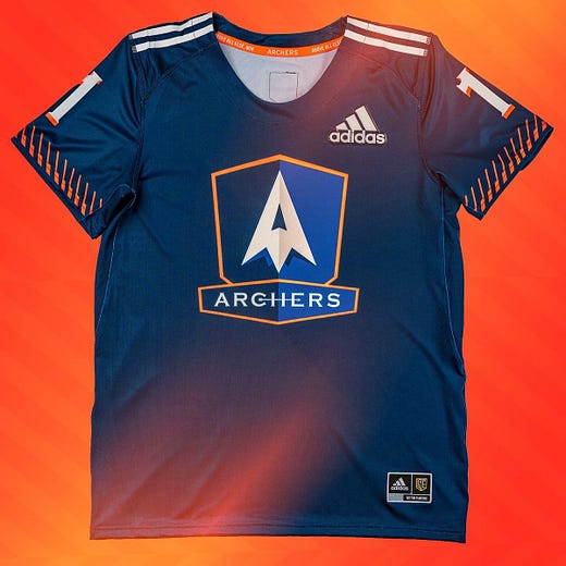
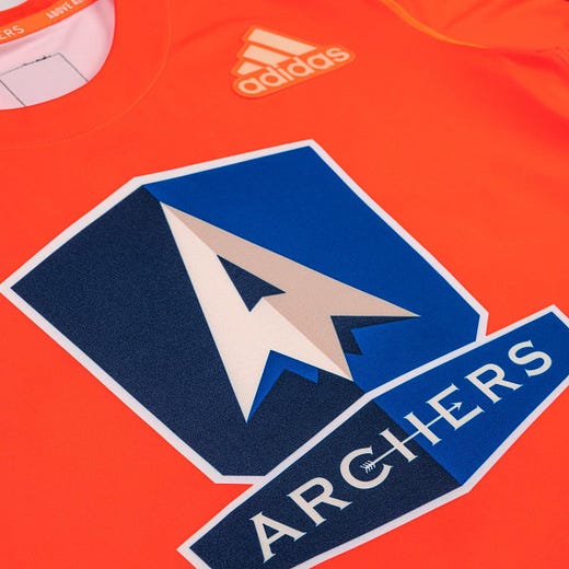
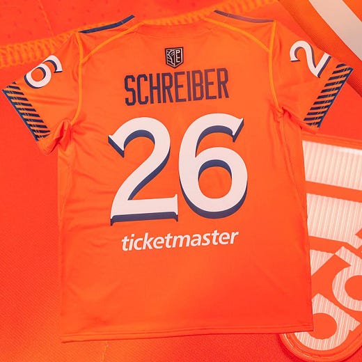
7. Archers
Tagline: Uhm. There are a lot. Meticulous seems the least egregious, though.
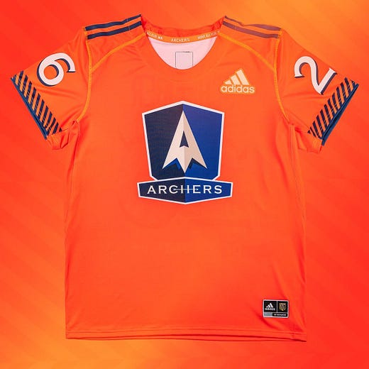
Best Feature: Having Orange be the primary jersey color is pretty great. I had to move this team way up in the rankings after seeing that hard lean into Flavortown. Before the infusion of orange, this jersey set was way down at the bottom. Their 2019 version is certainly the most unimaginative jersey set that the PLL put out. White and Navy, the smallest amount of orange trim. So, huge points for making a sizeable swap. Still white, blue, and orange, though.
Teams it also looks like: I mean...you know the Orange is pandering to the Cuse fans, right? There’s no way the focus groups missed that. It also feels the slightest bit like the Broncos and the Mets as well. But in a way that’s less a compliment than a slight because they could have gone wild with an arrow pattern or bullseye targets since everyone in the league is going to try and lock down this team’s insane offense and will ultimately fail.
6. Chrome
Tagline: Uh...Rigid Alloy? (That’s actually in the team description).
Best feature: The correct amount of pink and chrome. Perhaps the most difficult feat of all the teams on this list because one errant splash and all of a sudden you’re attending a gender reveal party on the set of the sequel to “Mad Max: Fury Road”. The 2020 version of the uniform is even more understated than it’s predecessor, so credit is given where credit is due. It’s still in the middle of the list because it’s just an absurd name and concept for a team identity.
Team it also looks like: A friendly biker gang. Could the entire Chrome team double as extras in the opening scene of Terminator 2: Judgement Day? Yes. Would Connor Farrell be pushed as the lead of the gang even though Jordan Wolf and Justin Guterding were the ones who did all the work to build the club up from nothing? Also, yes.
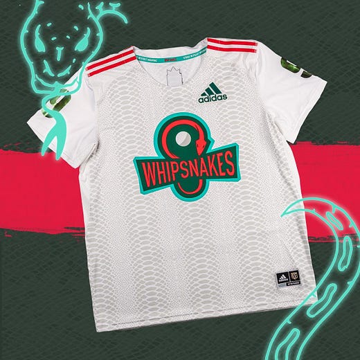
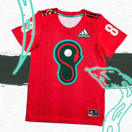
5. Whipsnakes
Tagline: The ‘Shipsnakes.
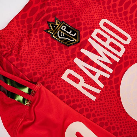
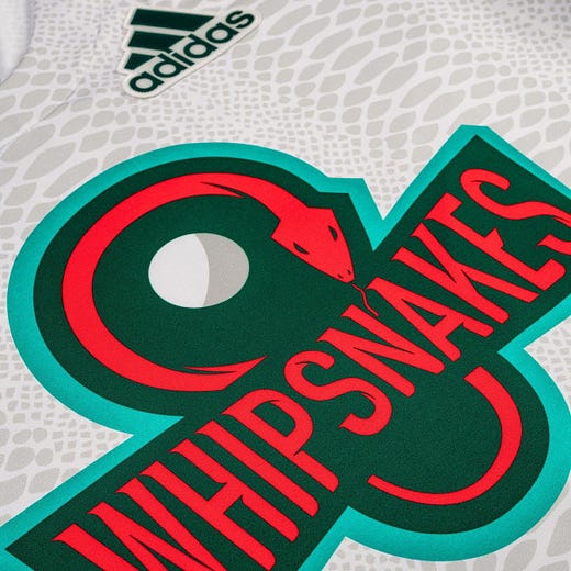
Best feature: Like many of the PLL jerseys, the background print works to accent the motif rather than destroy the aesthetic. But the real reason they’re ranked this high is because they put a crown on their logo which is...chef’s kiss. All of the anti-soccer people will hate it, but they hate everything anyway.
Team it also looks like: Team...Christmas. This is where all of the goodwill drains from the jolly face of old Saint Nick. Green and red? How did that combo get past the investors, guys? It’s so rough. You should have just made it red, black, and yellow with maybe a little green for the actual snake. Steer all the way into the skid. But as is, it still works because the context of the team informs the presentation. I can’t imagine Matt Rambo wearing another jersey.
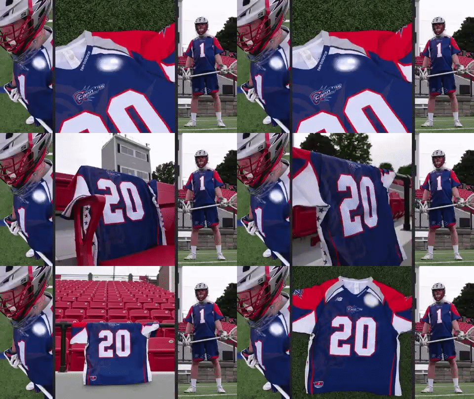
4. Boston Cannons
Tagline: Dood, we ahh so sick, dood.
Best feature: The alternate logos for the Cannons are their best assets. The crossed cannons logo is a great commentary on how every lacrosse logo was crossed sticks for the last 45 years. Oh, it’s not? It’s an homage? Oh, no. Well, I like it anyway. The tradition is here for the Cannons in the color scheme, even if that tradition is one title in 2011.
Teams it also looks like: Every other New England team ever. The Patriots are the first organization that comes to mind, but you can also add in the Red Sox, the New England Revolution, even the New England Freejacks - America’s rugby team. Do I have the Cannons ranked too high because of my undying fealty to the region? Yes. Yes, I do.
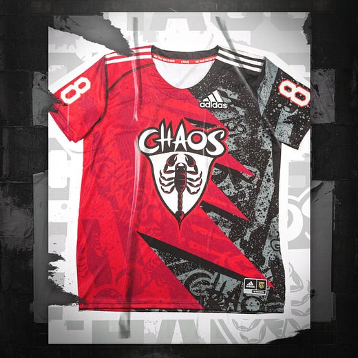
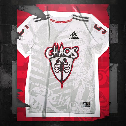
3. Chaos
Tagline: Because subtlety is for mimes.
Best feature: It’s like the empirical concept of insanity was given a pen and paper and told to write down their thoughts. Obviously, I love it. So scattered but also so deliberate. It’s light years better than their jerseys last year, which tried to do the exact same thing but failed because thorazine exists. This is a big swing that will miss for a lot of people, but it hits just the right spot somewhere in between the seams of pandemonium and nirvana. I honestly hope the team lives up to the promise of the jersey.
Team it also looks like: THE Clark University (and the Chicago Bulls, I guess). I am a sucker for any color palette that includes red black and white. It’s Pavlovian.
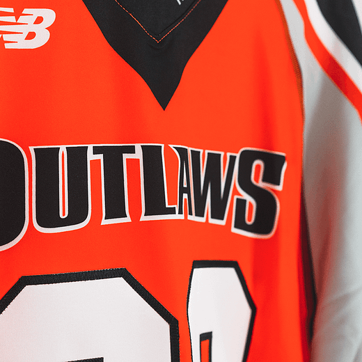
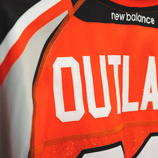
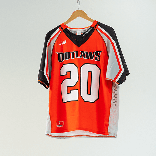
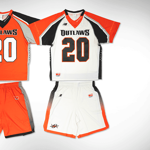
2. Denver Outlaws
Tagline: You’re a daisy if you do.
Best feature: The orange sometimes changes shades depending on the year, sometimes it’s a sepia-toned sunset sand color, but mostly it’s a brighter orange. Mostly. I swear one year it was a shimmery brown and no one even batted an eyelash. This is an example of a team with great primary and tertiary logos that jive perfectly with a color scheme (no matter how variable that scheme is). Extra points for not looking like a lost Halloween decoration.
Team it also looks like: This is unfortunate, but the Cincinnati Bengals. For a while, the Outlaws were Bengalish as they made the playoffs for years - including a season where they were undefeated - but then lost when it counted. Then they broke the cycle in 2014 when they won their first championship. They also missed the playoffs for the first time in their history the next season, but then they won two more championships, so they’re doing a lot better than Cincinnati.
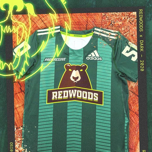
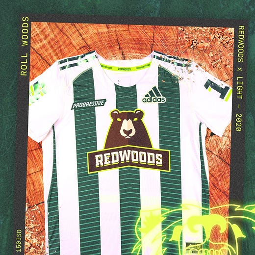
1. Redwoods
Tagline: The Wise Bears.
Best feature: Vertical stripes are WILDLY underutilized in modern jersey design. That’s because most of those designs are, indeed, terrible looking or at the very least untested in lacrosse conditions. However, in soccer [futbal] they are - for lack of a better word - iconic. It would be easy to mess up this look, but somehow the Redwoods nailed it two years in a row. Do I miss the sublimated trees from 2019? Yes. But at least the logo is prominently displayed and the jersey numbers are crispy and legible. It’s such a great color scheme and execution. I loved this jersey from the jump and the king stay the king.
Teams it also looks like: Real Betis mashed with Juventus with a better mascot. That’s a soccer reference. Ask your cool friends to explain it to you.


